Multi-purpose logo design.
This simple logo was designed for my racing team in Gran Turismo 7. I liked the result so much I’m using it for my site.
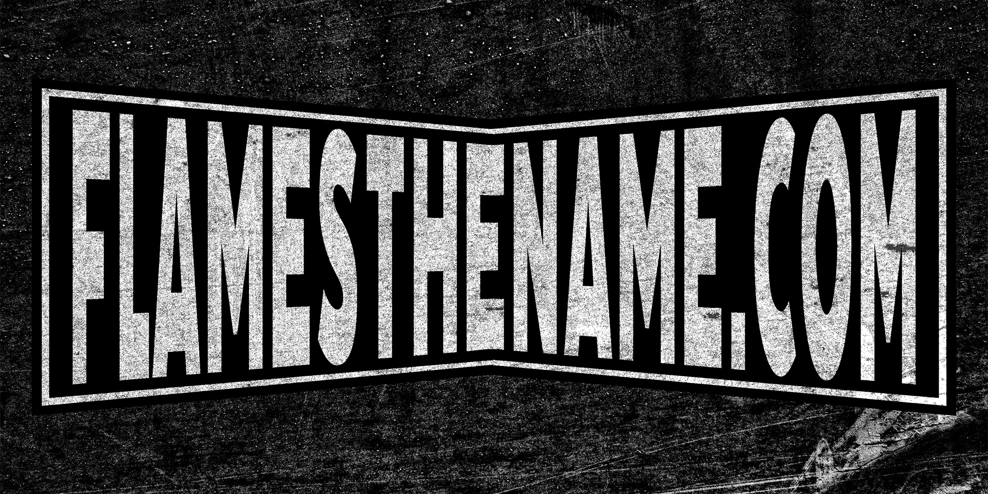
Technique: I started in Illustrator and made the bow shapes with a rectangle and then squeezed the middle together. I made three of the bow shape layers each with differing sizes to achieve the line effect (black, black, and white with incremental size increases). I used a simple block font and then applied an envelope shape with the font and smallest bow, giving the text a sharp squeeze effect that perfectly fits inside the bow. After exporting to Photoshop, two paper layers were added: one on top of the design and the other behind. A clipping mask was added to the top layer with the ‘pin light’ effect for a nice distressed effect. Multiply was used with the background paper layer to maintain formality throughout the design.