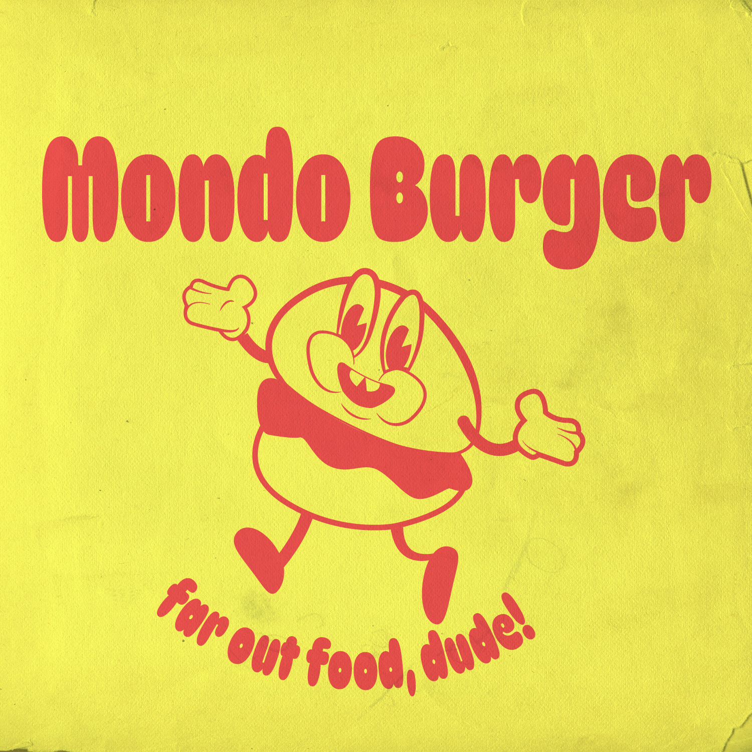
Creating the "Mondo Burger" retro fast food logo...
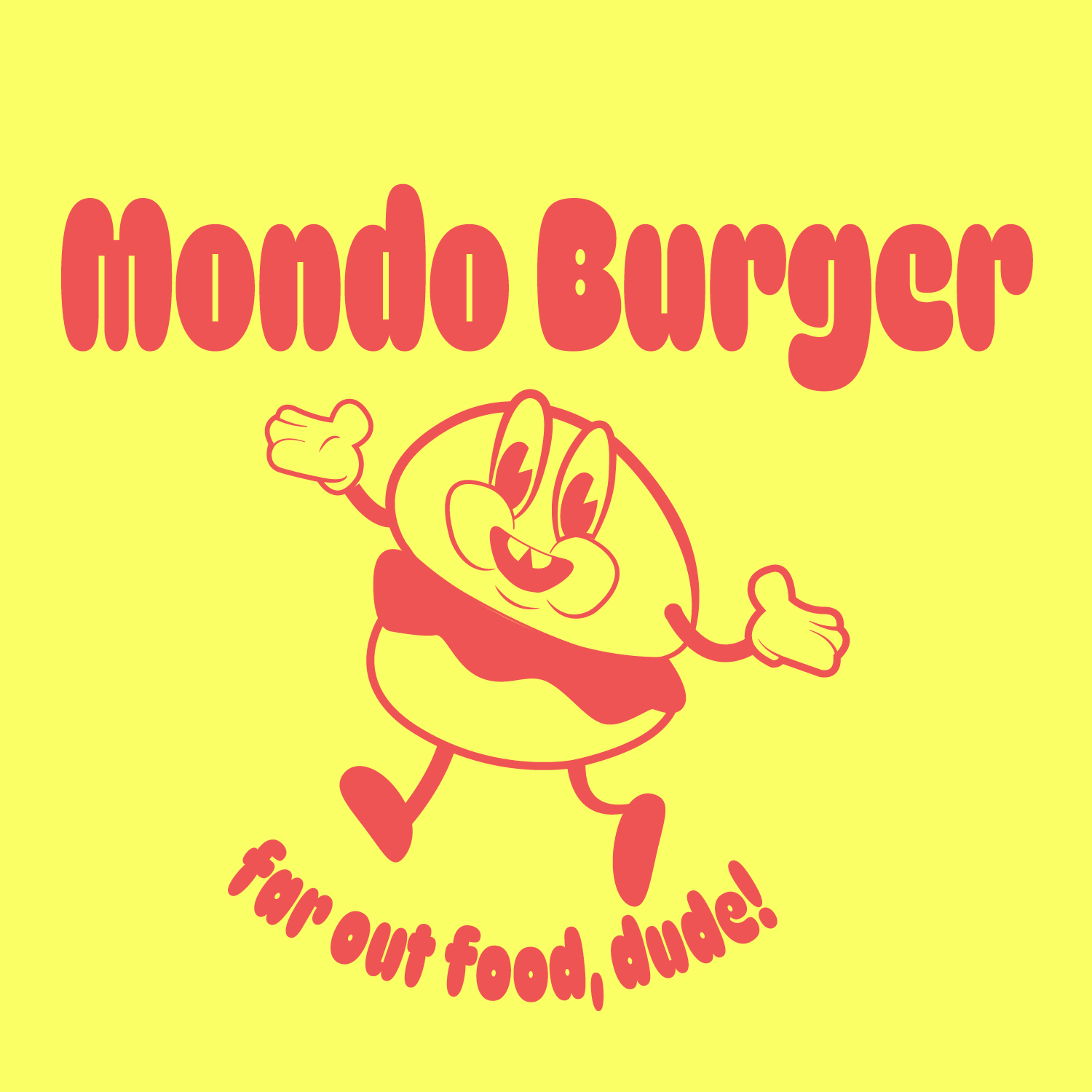
Concept Development: The first step was to brainstorm and sketch ideas that reflect a playful and nostalgic vibe, inspired by classic fast food logos from the past. The concept of a happy, anthropomorphic burger was chosen to embody a fun and inviting atmosphere.
Color Scheme: A bold and simple color palette was selected, featuring bright yellow and red. These colors are reminiscent of traditional fast food branding and evoke a sense of familiarity and excitement.
Typography: The font was chosen to match the retro aesthetic. Rounded, bold letters were used for "Mondo Burger" to ensure readability and create a friendly impression. The tagline "far out food, dude!" was styled with a whimsical and informal font to enhance the playful theme.
Illustration: The burger character was illustrated with exaggerated, cartoonish features to make it appear lively and appealing. Big eyes, a wide smile, and outstretched arms were included to give the character a welcoming and energetic demeanor.
Digitization and Refinement: The initial sketches were digitized in Illustrator. Each element was carefully refined, ensuring smooth lines and balanced proportions. The final design was adjusted for clarity and impact at various sizes.
Texture and Final Touches: To enhance the retro feel, a subtle texture was added in Photoshop, mimicking the look of aged paper. This gave the logo an authentic vintage appearance, making it look like it could be from a bygone era of fast food advertising.
The end result is a vibrant and charming logo that captures the essence of classic fast food culture, inviting customers to enjoy the "far out" offerings of Mondo Burger.
Thanks for watching!